"

Which is the best image format for your design project?

Which is the best image format for your design project?

It is seriously an important point to understand about the image and of course its formats :-) So, let's start with basic information first.

Images can be two dimensional (2D) like as a photo, or three dimensional (3D) such as a statue. They are typically produced by optical devices—such as a camera and natural objects such as the human eye. There are two types of image—Raster Image and Vector Image.


Raster Image

Raster Image format

You can see the majority of raster images online, you see I am also using raster images on this place. Raster images are digital images captured by camera or scanner or composed by design software like photoshop. They are made up of a grid of pixels, commonly referred to as a bitmap. You can typically reduce raster image without any quality loss, but enlarging a raster image causes it to look blurry and "pixelated."

Popular file formats of raster images
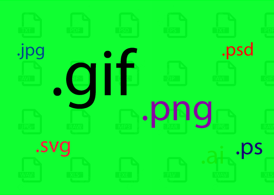
.psd   
Adobe Photoshop Document 

.gif     Graphical Interchange Format File
.png
   Portable Network Graphic .jpg JPEG Image
.bmp
  Bitmap Image File .tiff Tagged Image File Format


Vector

vector image format
 
Vector images are made up of basic geometric shapes such as points, lines and curves and shapes or polygons. Vector graphics are based on vectors (also called paths), which lead through locations called nodes. The relationship of the shapes is expressed as a mathematical equation which allows the image to scale up or down in size without losing quality.

Popular file formats of vector images
.svg
    Scalable Vector Graphics File 
.ai      Adobe Illustrator File
.eps   
Encapsulated PostScript File
.cdr    CorelDRAW Image File
.ps     
PostScript File

.fhd    FreeHand Drawing File 


Raster vs Vector

Raster vs Vector

Vector images can be enlarged as much as desired. A logo file produced in vector application like Adobe Illustrator or Coreldarw could be used for a business card, poster, or 10 feet wide outdoor-of-home hoarding without comprising with quality. But in aster files the resolution of a raster picture describes how many of these pixels exist over a set distance, usually horizontally: i.e. pixels per inch or (PPI) pixels per centimetre. If I enlarge a 300x image by 400%, it will therefore still have the same number of pixels across the actual picture area, but each represented pixel will cover a larger area—result bad pixelated image.


Choosing the right format totally depends on use and requirement. Let talk about different types of image formats—benefits and limitations.


JPGE: For better quality photograph

JPGE: For better quality photograph

JPG was designed for the storage of photographs and is in fact used in most digital cameras. It is lossy, so you do lose detail, but you can choose how much detail you lose. If you choose high quality then the JPG file will have all the details of the photograph, but the file size will be large. If you select low quality then the file size will be small, but the image will appear blurry and blocky. JPG is great for sending photographs via email, and for photographic images on the WEB.


GIF: For less colour and white space

GIF: For less colour and white space

It is ideal for images with a few colours and size will be small. That's why many graphics on WEB pages use GIF. Second biggest reason to adopt GIF is one of the few file formats which can contain animation. Not good for a photograph as it supports maximum 256 colours per image.


SVG: Vector graphics for web

SVG: Vector graphics for web

SVG is a revolutionary new image format developed by the World Wide Web Consortium (W3C), the organization that creates web standards. It is an XML-based vector image format for two-dimensional graphics with support for interactivity and animation. SVG images are vector based that can be zoomed in and out without losing any details. All major modern web browsers supports .svg file formats.


PNGs: For light weight and transparent designs

PNGs: For light weight and transparent designs
 
PNG is the most versatile of the current web graphic formats. You can see the full advantage of PNG characteristics such as 32-bit colour and transparency in only newer web browsers. PNG compression is a lossless format and can compress more than a GIF or JPEG of the same colour depth and quality, resulting in smaller file size. The PNG format is best suited for creating high-colour graphics or better compressed low-colour graphics.


PDF: For long documents, printer friendly

PDF: For long documents, printer friendly
Now days designers using PDF as final output file for printing as it preserves and embeds fonts, images, layouts and both vector and bitmap graphics of the native file. PDF files can be shared, viewed and printed by anyone on the web.


EPS: For print production

EPS: For print production
Uncompressed vector and raster format. EPS files are the preferred format for design professionals to transfer an image or artwork into another application for further processing.


Conclusion

Above, I tried to draw characteristic of all popular file formats based on my experience. Now, which format is best? Of course, that's totally depend on your requirement. So analyse your project and chose your file format... Go ahead!


Feel free to drop your comments and idea.
Read more ...

9 things you should know before starting your print layout (how to design)


9 things you should know before starting your print layout

So, finally you have decided to develop your own layout plan for your print project? Great! You are on right track! It's something like to develop a plan of your home or society. How it will look like? how to design? The main entry, green area, roads, connectivity, floor map of buildings, playgrounds, etc. In print project also you have to plan, how to describe your first page, overall layout look and feel, white spaces, colour planning etc.

Let's discuss few and but important elements of the layout designing which will help you to design better layouts of your design.

Alignment: How to align objects?

Alignment: How to align objects?
As the name indicates, it's all about how should we place text, images and other elements within the design. Alignment can be flush left, flush right, justified or centred. Flush left and flush right is sometimes referred to as left justified and right justified.

Bullets: How it can highlight message

A common character, usually used to draw attention to listed items or to show the hierarchy of various points. Popular bullets type is round, but it can be squares, diamonds, triangles, arrows, check boxes, check marks, stars, and other shapes. You can add bullet by your applications. You can insert bullet points at any applications, if it is notepad, browser search box by simple method:

TIP: Press & hold the ALT key on your keyboard and enter a number (any one from 4, 7, 8, 9, 10, 16, 175, 249, 250, 254, 0149) by numeric keypad at the extreme right of your keyboard (not the number keys below the function buttons), then release the ALT button.

Body Text: The main matter of your design

Body Text: The main matter of your design

It is he main section of a book, brochure, newspaper article, or other text material. The is size of body text across the table should be same for the design consistency.


Drop Cap: Eye catchy symbol within any text blocks
 

Drop Cap: Eye catchy symbol within any text blocks

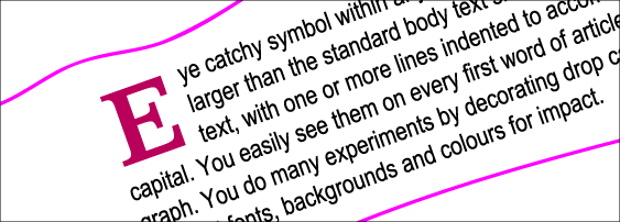
A single letter, larger than the standard body text size, set into a block of text, with one or more lines indented to accommodate the capital. You easily see them on every first word of article or paragraph. You do many experiments by decorating drop caps with different fonts, backgrounds and colours for impact.


Folio: The label of each page and section


Folio: The label of each page and section
Folio is the main element of indexing a book, newsletter or booklet! A common term for the page numbers which could also include name of book or section for readers to use easily. Neat clean and user friendly folio can inspire reader to read more in sequence.


Hyphenation: How to handle long words?
 

Hyphenation: How to handle long words?

With hyphenation you can set the guidelines how you big words will look like? Dividing words by leaving part of the word at the end of one line and continuing it on to the next, with a hyphen at the end of the first part of the word. Many words have their own rules for hyphenation that are not consistent with the general rules of the language, and must be hyphenated according to an exception word dictionary.

Indents: Good idea for paragraph style?

Indents: Good idea for paragraph style?By indent style you can set your text block accordingly to your overall style instead of manual spacing. First line of a paragraph can be indented so that a margin of the line or lines appears a fixed distance from the left and/or right margin. You can indent left, right or last line for accurate margin. You can use first line indent for first line of the paragraph and left indent for bullet points.


Leading: Can lead good layout?
 

Leading: Can lead good layout?

Leading is not a tough subject to understand—it is the spacing between lines of text. It is generally measured from baseline to baseline and expressed in points. Leading affects text's appearance and readability. Some fonts read better with increased leading due to long ascenders and descenders. In consumer-oriented word processing software, this concept is usually referred to as "line spacing" or "interline spacing."

Kerning: Key element good typography? 


Kerning: Key element good typography?

In design, kerning is the process of adjusting the spacing between characters in a proportional font, usually to improve the aesthetic appearance of most words that are set in all capitals especially in large display and headline text lines. Here we have discussed how to design regarding layout.

Feel free to put your comments below!


Read more ...

Yes Typeface plays a major role in the design

Yes "Typeface" plays a major role in the design, especially if you are working on a commercial project


What is typefaces?
A typeface is a set of characters of the same fashion, which includes letters, numbers, punctuation marks, and symbols. The term "typeface" is often confused with "font," which is a specific size and style of a typeface. For example, Verdana is a typeface, while Verdana 10 point bold is a font. It's a small difference, but is good to know.

Typeface is the “heart” of the art!

What is a good typeface? There are thousand of fonts available on the market. You should know which font to suit your design theme, and which can read easily. Although some of the identifying characteristics of a good typeface are universal, others depend on text or display applications.

Categories of Typefaces: Serif and San serif

Popular typefaces include Times Roman, Arial, Helvetica, Courier and Verdana. Here we will discuss about the appropriate type face. There are 2 types typefaces: serif and sans serif. Serif typefaces have small decorative marks to embellish characters and make them easier to read, Times New Roman is a great example of serif type. Sans serif typefaces are designed of simple lines, and Helvetica falls under sans serif typeface.

Use simple typeface for better visibility

Use simple, readable typefaces for your design. You can use Times New Roman, Century, Palatino and Bookman, which are good typefaces for large blocks of text, while Arial, Futura and Optima are good for headings or small blocks of text. For each typeface you have several options like - bold, italic, outline. Expanded and Condensed typefaces are difficult to read. So the chances are high that the reader will skip your message.
Do not use curly or decorative borders or ornate embellishments.

Different typefaces for various mediums. Print is different from digital, digital is different from outdoor.
Don't be confused, I mean to say that you too have decided how and where the design will be used? If you are designing a print ad then you can use Times New Roman or Agaramond font for heading and Helvetica for subheading. Using Helvetica for web banner will be a great idea. For Outdoor advertising material you, should you solid typeface to get it readable from long distance too.

A technique aspect while choosing typeface and its colour
There is technical aspect too before choosing fonts for your design. Like for printing designs—avoid screens, If must require only use a screen behind a block of type, do not make it more than 20 per cent. With this your typeface will readable, although don’t use complicated background. You should use contrasting colours for your fonts against your background. A very thin stroke fonts may merge with your background.
Read more ...

Design industry has good potential as career goal in year ahead

Design industry has good potential as career goal in year ahead

Don’t ever think that art is an easy career. In today’s scenario, employers looking for the person with multi-tasking—like he/she can come up with great concepts, transform concepts into execution with branding guidelines, develop graphics for print, web & broadcast. An employee who is dedicated, responsible, punctual, and talented is a rare gem. I don't want to demotivate you, but want to let you know the overall situation of evergreen career.
Yes, you can the part of this growing field with proper learning dedication and handwork. Don't forget to most popular quote--- “ Practice makes a man perfect”. So do not wait and start your journey of good designer.

Design field has huge potential, from print ad (newspaper layouts to packaging designs), web (web design to apps interfaces), interactive media (animations to UX designs) to broadcast design (graphics and animation for TV channels).

The ability to conceptualize is more important than sketching perfection. You can get double benefits if you hand-sketching to draw storyboards, create characters in your comic books and create icons for your logo designs.


Graphic Design Jobs cover all ends of the creative task. Here is the sum of them....

Art Director
Art director is the head of a creative team. He is responsible for produces artwork for Newspaper, magazines, on television, on billboards, on the web, or on medium by handling team of senior designers, visualizers & junior designers.

Creative / Graphic Designer
Creative designer works closely with art director on various projects. He is responsible to develop final design based on brief of the client or art director.

Layout Artist
A layout artist deals with the structure and layout out of images and text in a pleasing format for various media. There is huge demand of layout artists on big media/ publication houses for their various newspapers, magazine and tabloid.

Photo Editing / Photoshop Artist
Cameraman click shots, indoor and outdoor AND photo artist makes it great photo w.r.t correct lighting, colors and depth.
Photo editing artists play a major role by correcting/editing photos before using them on magazine articles, etc. He does the photo editing on various photo editing applications like adobe photoshop with hands-of-experience and need.

Illustrator
Illustrators conceptualize and create illustrations that represent an idea or a story through two-dimensional or three-dimensional images and illustrations.
You could see any newspaper & magazine articles in which they used infographic (artistic imagination of any subject with images and graphics) of any crime sequence and new technology. Illustrators may do drawings for children's books, character design etc.

Web Designer
As a web designer, your work could be viewed by thousands of people every day. Web designers create the pages, layout, and graphics for web pages, and play a key role to create  a website. Web designers have the task of creating interfaces for web pages, animations to display on websites.


Multimedia Designer
Jobs in multimedia design found in such career fields as television or film production, animation, audio production, and set design, as well as several other multimedia, and production design fields. Multimedia designers create 2D & 3D animations, special audio-video effects for different kind of productions.
Read more ...

Layout is not too tough to understand but need deep concentration to build effective layout


layout planning


Would you like to prepare an Newsletter, book or advertisement for your society or community? You have arranged photos, text matter and society logo. The size is also with you, it will take some amount of time to create the layout for your design. You have already learnt the principles of design, with a help of these basic tips you can easily prepared a good design layout and your society members also like it. You can send the final design to the printer for printing.


How to create a good layout?


First of all Planning!

design planning
Planning is must for any structure. To construct a building you need a plan chart, so you can arrange the whole thing before you start. Like a building, a graphic design is also a structure. A design planning know as a layout. To prepare layout for your design you need photo or illustration, headlines and copy, logo and another details. Now you can plan to design an advertisement as per your requirement with available space.


Scribble your idea on paper...
Scribble your idea
After spending a lot of time, You have prepared the design. Ohh no... you find that some pictures missed out and the logo also need to increase. Now to include the pictures and logo expansion, you have to arrange the whole design again. This type of situation could be avoided, if you had first developed your idea in you mind and put the rough sketch on the paper that gave the basic compositional arrangement. With this rough sketch you can try various alternative options which suit to your requirement.

Final layout

final layout
 
The next step is to create a proper page layout for your design. The term “page layout” is used simply to describe the way text and images are situated on a page. For professional look and feel, you should follow these basic things when doing the layout.  

Alignment:  If you go for center alignment, it will give formal look. Generally used for personal announcement, wedding cards, etc. Left alignment will give a professional look. When you want clean and well order layout, you can try Full alignment. With this you can try the heading / photos left, right or centered.

Bitmap pictures are stored as a vertical and horizontal array of Pixels and stored information represents the colour of each of these pixels. The resolution of a bitmap picture describes how many of these pixels exist over a set distance, usually horizontally: ie pixels per inch or pixels per centimeter. An unaltered bitmap picture of 300 pixels / inch enlarged by 1000% will therefore still have the same number of pixels across the actual picture area but each represented pixel will cover a larger area.Your page layout should be visually appealing and keep the readers interest.  You can make your page noticeable by using of font style & size, and colour.  Use a contrasting typeface and colour for headings and keep them very different from part of design. 

Type: Type is very important element in layout, so always use an easy-to-read typeface. For legible text we need topographies with a simple fonts without complex details. The reader should pay attention to the content and not the text. If you have lot of text matter then avoid using a light version of a type face because reading of this text will probably become tiring and nobody will want to read it.
Avoid using many type faces in single design Job, it create confusion.
Always set the font size against importance of information. What should right size of type? newsletters are 10-, 11- or 12-point. Type sizes for presentation graphics, posters and displays should be larger. For Example of A4 advertisement. The type should be : Heading: 30 pt., Sub Heading: 22 pt., Body Matter: 12 pt., Address Portion: 8 pt.,

Color : Use colour to catch reader's attention and also as a tool for directing the viewer's through the message. Pick colors for type and illustration that match well with the background color. Despite of using multiple colours, a simple color scheme of 2 or 3 colors, with only one of the colors being a highlight color, can often communicate more effectively.

Margins: Margins are the imaginary vertical limits for text columns. Establishment of margins is very carefully job. The white space surrounding printed material effects both appearance and the readability of the layout. Big amount of marginal space indicates luxury or formality; small margins indicate commercialism. For example, a dictionary utilize more than 85% of the paper for type. Whereas, a product catalogue utilize 30% of the area for type, leaving 75% for margin.
Read more ...

Brainstorming to crack the concept for stunning designs

design concept

“It's not rocket science. It's social science – the science of understanding people's needs and their unique relationship with art, literature, history, music, work, philosophy, community, technology and psychology. The act of design is structuring and creating that balance.”
-Clement Mok.

“...some graphic designers don’t just pick colours and take orders for typefaces.”
-Chip Kidd.

"Art is the lie that makes us realize the truth."
- Picasso

Designers are responsible for creating notable designs that will catch the public's eye and increase a company's sales. To be successful, designers must also possess excellent interpersonal skills and the ability to sell their ideas to executives.

Art is much more than drama, dance and music which can found inside galleries and theater. There are many skillful activities, but "art" is really special.

Designer create art to communicate the message, feelings, and ideas through graphic components, logo and pictures or illustration.


Creativity in Design!
Creativity : a creative imagination.

We cannot define creativity in words. Creativity is an abstraction conceived by the imaginative instincts of an artist's mind.

The Three wheels  : 1. Written Message  2. Pictures   3. Layout.

Graphic design is not mere decoration of the written message; it is a conscious and meaningful effort to maximize the impact of the written message. A truly effective design is the combination of message content and message presentation. The main function of designer is translating the idea or message into very simple way to understand.

Most message needs some more design to increase it impact and appeal. Headline size and typeface, placement on a page, margins and boards and other things will determine whether a particular message will hit the target audience or just flip the pages and continue reading the another matter.

And one creative designer must not only be familiar and expert with graphic tools and application, but he or she must also be familiar with a wide range of typefaces and know how to incorporate them for the right effect. Because design tends to change in a similar way to fashion, graphic designers have to be up-to-date. 

Read more ...

Design principles can help you to develop exciting design

design principles
Designers or artist create lot of fantastic designs, but there are some basic principles that they use that can be helpful in everyday design, whether you do it by hand or with publishing tools.

A design is an arrangement, a way of organizing something. We need to follows these principles which are the fundamental concepts that will help you to communicate the key them of your design. It is well organized manner which look good & easy to communicate your message. After do regular practice & experience, it will comes to your mind automatically!

Let's start...with these magical factors! 

Alignment

design alignment

Every design element should be well aligned with other design elements. Basically, alignment focuses on the placement of graphical & typographical elements and their relationship to each other and as a whole. With help of alignment we can decorate our design with opposing elements symmetrically. 

Balance

Design Balance

Balance is most important for a perfect design. The balance between objects, colors, texture, and space makes the design stable! We must place elements on the page in such a way as to make them look comfortable on a particular space. Most successful compositions achieve balance using symmetry or asymmetry. 

In symmetrical or formal balance, the elements used on one side of the design are similar to those on the other side. Symmetrical balance gives us the feeling of carefulness, accurateness & formality. Text books, Newsletters etc. are the good example formal balance.

In asymmetrical or informal balance, the elements are different but still look balanced. In radial balance, the elements are arranged within in radius. The central point of elements may be similar.

Balance is the concept of visual equilibrium. It is the combination of opposing elements in a composition that results in visual stability. 

Contrast
design contrast

If you want to highlight some points among the others, you have to do something different like increase the size or change the font, that's called "Contrast". In any form of communication, main points should be stressed more than others. In design, big and small elements, different shapes, black and white text, squares and circles and Colors can all create contrast in design. 

Line
design line


You can get a line to extend a point. Lines is a mark with greater length than width. Lines can be horizontal, vertical or diagonal, straight or curved, thick or thin. Lines may be real or imaginary, edges of elements, group of letters. It can be heavy to light, continuous or broken, straight or curved. You may find your lines say sometimes things you didn't means to say, for optical illusion may be at play. As a designer, you ought to understand the complexities of optical illusion and how it affects your design. 

Shape
design shapes
Shape is a closed line. There are numberless variations and combinations of shapes, but square, circle and triangle are the basic shapes. In the design Shapes are most important element, some shapes use for information while some others for decoration. 

Tone
design shapes
  
The word "tone" means the value of lightness or darkness of any surface colour which can be feldt by our naked eyes. We can divide the colour into thee parts, like : Hue (its name) like cyan, megeta, yellow, black, Second, Value (%) like amount of lightness or darkness and the third one is Intensity, how bright or dull it is. 

Unity
design unity

Individual elements of your design should be relate to each other and to the total design, so you can hold all together. In the other words Unity refers to the combination of all elements successfully working together to achieve a sense of harmony in your design. Unity is the feeling of harmony between all parts of the artwork creating a sense of completeness. Using repetition or patterns is one of the most basic factors in creating a strong sense of unity. 


Read more ...

Design is everywhere.


You can see design everywhere, morning newspaper to late night movie ticket!

design is everywhere...
People use design everyday for personal and professional tasks. It is just so easy, anybody can design, if he has a creative mind. You can design business cards, flyers, invitations cards on your home computer with help of design & publishing tools. Some time we have to design greeting cards, signs, powerpoint, invitations, photo albums, postcards, attention poster, personal advertisements for work or Fun.

Do You...?
Do you see yourself as a Designer? Do you want to learn to attractive graphics design from the ground up?

Don't worry, you are in the right place : )

We will teach you the basics things which will help you to get on the play ground to creating, designing and implementing solid designs.

Its FREE...
It rocks. In a simple and straight forward way, you can learn DESIGNING for FREE. Here you will begin by understanding and implementing the foundations of design: the basic elements and principles of design. These elements and principles are applicable to all design mediums such as graphic design, art, architecture, print and web.

You hadn't formal training in design,? No problem, this site will bring you up to speed with the fundamentals of design, while learning how to apply concepts, elements etc.

Read more ...